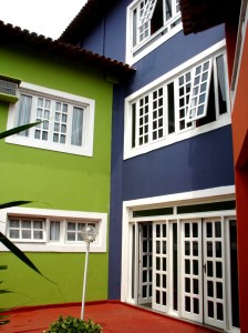
Color schemes for paint projects
Putting together a paint palette
Glassprimer™ glass paint can be tinted to match any color from any major paint manufacturer. This means you can select your paints using the color chips you find in the store, and then order Glassprimer™ glass paint for paint projects. You can be sure that the glass paint will match the chip exactly!
Monochromatic colors
You can put together a monochromatic palette that includes multiple variations of a single color. Try blending a palette using varying saturations of the same color. Multiple monochromatic shades will produce a calming, soothing effect and work well in bathrooms and bedrooms.
Complementary colors
The color spectrum is often displayed as a continuum known as a “color wheel.” Using the 360-degree notation, complementary colors are those that are 180 degrees away from each other on the color wheel. In this scenario, yellow is opposite of purple, so yellow and purple are complementary colors. Blue is complementary to orange, red is complementary to green, and so on. Complementary colors can work well together within limits in paint projects, but they are instant attention-grabbers that need to be balanced out by other more neutral colors.
Analogous colors
Analogous colors are those that sit next to each other on the color wheel. Analogous colors often make comfortable companions in paint projects. Examples of analogous colors would be blue and blue-green, or green and yellow-green. Analogous colors are similar, but not quite the same, so they create interesting and harmonious combinations. When working with analogous colors, pay attention to the saturation of your analogous color choices to maintain the friendliness of your palette.
Split complementary colors
The split complementary approach to color is a complementary compromise. To create a split complementary paint palette, choose a primary color, then choose the colors immediately adjacent to the complement of your primary. Confused? If your primary is yellow, its complement is purple. Instead of choosing purple for your paint projects, choose blue and fuchsia – the two colors adjacent to the complement. You may need to play with the saturation of your colors if you plan a split complementary palette.
In the next post, I’ll look at additional color palette ideas. In the mean time, if you’d like more information about working with different colors in paint projects, or you’d like to shop for glass paint, please visit our online store!
Photo Credit: Rafael Rocha, via FreeImages.com

